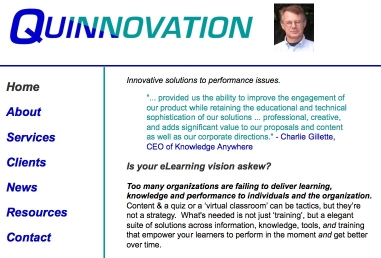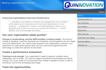
I’ve been busy updating my website. The previous version was done by hand in an old version of Adobe’s DreamWeaver, and while it was very light and minimal, it wasn’t very ‘elegant’. For instance, I’d had one problem that really bugged me, hadn’t been able to fix (though recently I managed to beat it into submission). I had several options: continue to maintain it, pay someone to do a better job, or find some tool that makes it easy to make reasonable sites. I got my mitts on a copy of RealMac’s RapidWeaver, and started to play around.
RapidWeaver uses templates: there are quite a few included, and you can pay for more. I wasn’t completely happy with any, but by systematic exploration (aka messing around), I managed to make one I was happy with. (Recognize that the small size of the screenshots can make the old one look plausible, but it was a bit space-wasting; e.g. it’s still readable at 50%!) I haven’t dived into the actual design behind the themes, as that takes me somewhere I don’t want to go. Still, when I’d find things I thought it couldn’t do, I’d look deeper and find it. It took quite a few attempts to get things the way I liked them, but it’s mostly quite clean. Yes, I could delve into CSS and PHP and really get a handle on it, but that’s not the best investment of my time, and I could’ve stuck with DreamWeaver. It’s enough that I understand what they do, without getting into the syntax of a specific site.

The interesting thing to consider here, however, are the tradeoffs. I wanted a decent starting point, and the application handling all the background work when I changed things around (like maintaining the navigation bar, adding the cookie crumbs, etc). I didn’t want to have to tweak everything myself. If I were a professional web designer, I’d want power tools; if I were an amateur I’d want hand-holding. As it is, I want something in-between. RapidWeaver does a relatively elegant job of providing simplicity upfront but letting you open up the hood and mess about inside. I had to get deep into the program to get done some things I wanted to get done, but it’s output is better than I was getting on my own. Note that if you use it’s built-in ‘text and image’ pages, I don’t like how it looks. I went to HTML pages (which I can handle).
The more general lesson is that there are no right answers, only tradeoffs. Ideally, you get more power as you take on more learning. Andrea diSessa termed this ‘incremental advantage’, where well-designed tool environments give you more power as a direct outcome of your willingness to explore. HyperCard had this, as you could start with just draw tools, but then explore fields, buttons, and backgrounds (before you hit the ‘HyperTalk’ programming language wall).
There’s been notable progress in providing power tools (though too many people don’t even know about the concept of ‘styles’), but there’s still a pretty linear relationship between learning and power. For example, as I have mentioned before, everyone wants the full game development tool that doesn’t require programming, though I argue it can’t exist. It’s nice (and all too rare) when you get an elegant segue from templates through to being able to open up the underpinnings.
Understanding the tradeoff between ease of use and power is important in bringing knowledge, information, and tools to your learners, as well as your own learning tools. You’ll want good defaults, and then the ability to customize. Some of our tools are still not doing a good job of that, and the tutorials still tend to be focused on either product features or rote procedures, instead of helping you understand the software model underneath. We could do a lot better!
Back to your user goals: you’ve got to know what you’re trying to do, how much you’re willing to learn about it, and live within what that gives you. And I’d like feedback on the new website. Put on your ‘potential customer’ goggles, prepared with what you’d want to know, and have a look; I welcome feedback to improve it!
