So, I’ve been creating a ‘deeper elearning’ course for one of the video course providers. And I’m not mentioning where it is (yet), since it’s still under development. But to do this, I had to do some serious learning about creating video. And there were some realizations in this, of course.
One of the decisions to be made was how to include graphics.. My mentor/colleague/friend showed me (by video chat) his elegant setup. He has green screens, and lights, and has a full studio in a separate room as well. Of course, he’s been doing video for decades. I’ve hardly done much besides taking a multimedia course at least 20 years ago. And narrating the occasional Keynote deck.
In the meantime I asked around, and colleagues were pretty unanimous on ScreenFlow being the tool to use. So I got a copy. And, indeed, I was able to film myself. Moreover, I quickly found out I could include diagrams and text right on the screen! That eliminated the need for a green screen.
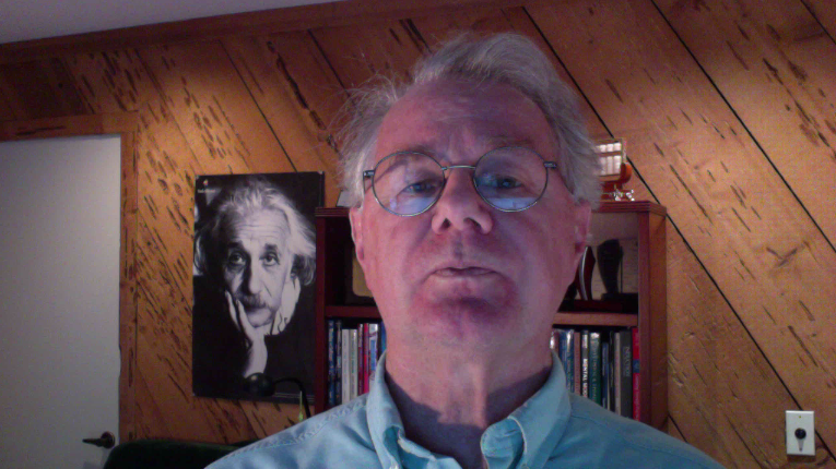
 I had a couple of lights, and without them my screen reflected on my glasses. However, that’s not really fixable, since I didn’t get the anti-glare coating when I had them made. Doh! Next time, for sure. I positioned a couple of lights off to each side, and they reduced (though not eliminated) the glare.
We were moving my office back to the front of the house (long story), so we moved a bookcase behind me, with my library. It looks good, but…you don’t see much of it anyway. I filmed standing up (on my new stand/sit desk converter), and I block most of the background anyway (except for the Albert Einstein poster that sits on the wall).
Having read up, I knew to have a written script, which, without a prompter, I just positioned to the top of the screen under the camera. Of course I changed it a bit, and adlibbed a bit, but mostly stuck to what I’d written. It’s not quite as spontaneous (and goofy) as I am in person, but it ensures consistent quality. And I filled in diagrams a few times, and added some text a few times, to help keep pace.
Frankly, it’s not great, but I had a deadline. It’s too much of me talking, without animation. But this is done by me, alone, under a tight deadline. And that’s my error, too, since I have video anxiety almost as bad as my phone anxiety, and dragged my heels until things were too late. Dang emotions getting in the way again! (Even when you know this.)
I also created some quizzes, in mini-scenario fashion pretty much. That is, there’s a fair bit of dialog that you either are asked and/or choose to respond with. Because it’s only a multiple choice option, I was somewhat constrained. I subsequently was prodded for some assignments, and found I could do what I’d talked about. I used the assignment tool to create questions that asked learners to go out and do things and then provide them with some guidance to self-evaluate.
One thing I learned is that I don’t have a good mental model of how the software works. I ‘get’ the tracks, but there’s another aspect I don’t understand. So, it turns out though I’d filmed myself at 720p, and exported at 720p, it still had an unnecessary border. Fortunately, in stumbling around I found a ‘crop’ setting that forced it to 1280 x 720 (720p), but I don’t understand why that was necessary!?!?
I still want to add some examples (as documents) before I feel it’s fully ready to go. And I now sympathize much more with those who struggle to do good learning design under real-world constraints. It’s also certainly been an example of my accepting assignments that are within my reach, but not within my grasp; my learning style ;). More later, but thought I’d share my struggles and learning. I welcome your feedback.
Leave a Reply