Time for a brief rant on interface designs. Here we’re talking about two different situations, one device, and and one interface. And, hopefully, we can extract some lessons, because these are just silly design decisions.
 First up is our timer. And it’s a good timer, and gets lots of use. Tea, rice, lots of things. And, sometimes, a few things at a time. As you can see, there’re 3 timers. And, as far as I know, we’ve only used at most two at a time. So what’s the problem?
Well, there’re different beeps signaling the end of different timers. And that’s a good thing. Mostly. But there’s one very very silly design decision here. Let me tell you that one has one beep, one has two beeps, and one has three. So, guess which number of beeps goes to which timer? You can see they’re numbered…
Got your guess? It’d be sensible, of course, if the one beep went with the first timer, and two beeps went with the second. But you know we’re not going there! Nope, the first timer has two beeps. The second timer has 3 beeps. And the 3rd timer, of course, has one.
It’s a principle called ‘mapping’ (see Don Norman’s essential reading for anyone who designs for people: The Design of Everyday Things). In it, you make the mapping logical, so for instance between the number of the timer and the number of beeps. How could you get this wrong? (Cliche cue: you had one job…)
 On to our second of today’s contestants, the iTunes interface. Now, everyone likes to bash iTunes, and either it’s a bad design for what it’s doing, or it shouldn’t be trying to do too many things. I’m not going there today, I’m going off on something else.
I’ve always managed the files on the qPad through iTunes. It used to be straightforward, but they changed it. Of course. There’re also more ways to do it: AirDrop & iFiles being two. And, frankly, they’re both somewhat confusing. But that’s not my concern today. The new way I use is only a slight modification on the old way, which is why I use it. And it works. But there’s a funny little hiccup…
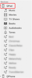
So, there are two ways to bring up a list of things on your iPad. For one, you select it from the device picture at the top (to the right of the forward/back arrows), and you see a list of things you can access/adjust: music, movies, etc. As you see to the left.
 On the other hand (to the right), you select it from a list of devices, and you get the drop down you see to the right. Note that the lists aren’t the same.
Wait, they’re not the same? No, only one has “File Sharing”! So, you have to remember which way to access the device before you can choose to add a file. This is just silly! Only recently have I started remembering which way works (bad design, BTW, trusting to memory), and before that I had to explore. It’s not much, just an extra click, but it’s unnecessary memory load.
The overhead isn’t much, to be clear, but it’s still irritating. Why, why would you have two different ways to access the device, and not have the same information come up? It’s just silly! Moreover, it violates a principle. Here, the principle is consistency (and, arguably, affordances). When you access a device, you expect to be able to manipulate the device. And you don’t expect that two different ways to get to what should be the same place would yield two different suites of information. (And don’t even get me started about the stupid inconsistencies between the mobile and web app versions of LinkedIn!)
At least if you haven’t communicated a clear model about why the one way is different than the other. But it’s not there. It’s a seemingly arbitrary list. We operate on models, but there’s no obvious way to discriminate between these two, so the models are random. Choosing the device, either way, is supposed to access the device. That’s the affordance. Unless you convey clearly why these are different.
This holds for learning too. Interface folks argued that Gloria Gery’s Electronic Performance Support Systems were really making up for bad design. And so, too, is much training. Don argued in his The Invisible Computer that UI should be up front in product design, because they could catch the design decisions that would make it more difficult to use. I want to argue that it’s the same with the training folks: they should be up front in product or service design to catch decisions that will confuse the audience and require extra support costs.
Design, learning or product/service, works best when it aligns with how our brains work. If we own that knowledge, we can then lobby to apply it, and help make our organizations more successful. If we can make happier users, and less support costs, we should. And as Kathy Sierra suggests, really it’s all about learning.
Leave a Reply