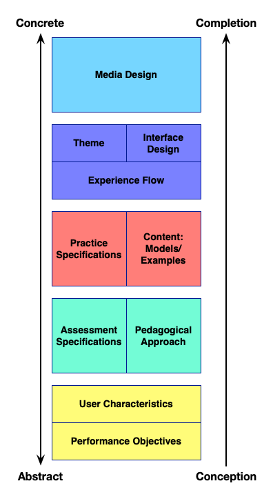
I stumbled across the Elements of UX diagram again, and happened to wonder if it would map to LXD. Here’s my stab:
And the text, as usual.
In a justifiably well-known image (PDF), Jesse James Garrett (JJG) detailed the elements of (web) user experience. I‘ve been involved in the parallel development of UX and ID (and cross-fertilized them), so I wondered what the LXD version would be. So, of course, I took a stab at levels of LXD design.
To start with, JJG‘s diagram works from the bottom up. The five levels, in order, are:
- The original objectives and user needs.
- That leads to content requirements and/or functional specifications.
- The next level is an information architecture or interface design that is structured to meet those needs.
- Those semantic structures are then rendered as an information design with navigation or interface design.
- The top level is the visual design, what the user actually sees or experiences.
This systematic breakdown has been well recognized as a useful development framework. The development from need to semantics to implementation syntax suggests a logical development flow. As an aside, no one‘s claiming we should develop in a linear manner, and there tends to be more up and down action in actual practice. Drilling down and then working from the bottom up as well is a well-known cycle of design!
 The learning equivalent, then, should similarly have a structured flow. We want to go from our needs, through various levels of representation, until we reach the learner experience.
Given that we should be driven not by the goals for the interface but learner needs, I‘ll suggest we start with the performance objectives. Then, in parallel with user needs, I‘ll stipulate that the other top-level definition comes from the user characteristics. These match the initial level stipulated.
At the next level, I‘ll suggest that the performance objectives drive assessment specifications, and the other decision at this level is for the pedagogical approach. We need to know what learners need to able to do, and how we‘ll get them there.
As an intermediate representation equivalent to UX‘s information architecture or interface design, I suggest from the assessment we determine the necessary practice activities required, and these are coupled with the necessary content requirements: models and examples, as well as the introduction and closing. Here we‘re still at what‘s required, not how it manifests.
The next level is where we start getting concrete. We need to pick an overall theme or look and feel, and the flow of the experience. We‘ll also, of course, need to make a consistent interface to support navigation and taking action. We know what we need to have, but we haven‘t actually rendered it yet.
Finally, we must render the necessary media. This will be the videos, audios, text, diagrams, images, and more that comprise the experience. This includes the actions to be taken and the associated consequences of each choice.
That‘s the equivalent structure I‘m suggesting are the different levels of LXD design. Of course, this is a thought exercise, and so I may well have made some interpretations you could disagree with. For instance, I may have slavishly followed JJG’s levels too closely. Let me know! Also, it‘s not clear whether this is a useful representation, so far it‘s sort of a ‘because it‘s there‘ effort ;). You can let me know your thoughts on that, too!
Leave a Reply