Previous Series Post | Last Series Post
This is one in a series of thoughts on some broken areas of ID that I’ve been posting for Mondays. The intention is to provide insight into many ways much of instructional design fails, and some pointers to avoid the problems. The point is not to say ‘bad designer’, but instead to point out how to do better design.
Instructional design has established that the correct order of elements is introduction – concept – example – practice (and feedback) – summary. While that’s a good default, it doesn’t have to be that way, and there are times when it makes sense to provide other approaches or even self-navigation. What we shouldn’t see is the prevalent (click to advance ‘next’ button), with linear navigation forwards and back. Or, rather, we shouldn’t see that without some other support. And more.
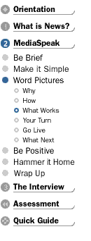
 When we did a course on speaking to the media (and without an LMS to handle the navigation, so no built-in ‘next button’), we had a scheme that both provided a good default, and allowed self-navigation. We had the elements of each of the 3 modules labeled from a learner perspective (e.g. Show Me, Let Me). And we had a nav bar in the upper left that let you choose where to go. At the bottom of the screen (we erred for scrolling rather than one page to minimize clicks and load times, this was over 10 years ago) were also some options of where to go next, with one indicated as the recommended choice. We graphically supported this with a dotted line leading the learner through the content and to the default choice (follow the bouncing ball).
Was there benefit from this? Anecdotaly, I heard (I’d returned to the US) that about half the users followed the bouncing ball, but the other half (presumably the self-capable learners) took the initiative for their own learning and used the nav bar to go where and when *they* wanted to. I note that UNext/Cardean had a similar nav structure at one time.
Now, you may have heard of case-, problem- or project-based learning. In this case, before you present the concept, you present either an example (a case-study) or a problem. These serve as the introduction, but are attuned to different ways of learning.
If you buy into some of the learning style models, they have cycles through different learning approaches, but recognize that different learners could prefer to start in different areas. That was the premise that drove at least part of the strategy behind the adaptive learning system project I led from 1999-2001. We had the system recommend a path, and alternatives, but it was based upon who they were as a learner.
It turns out that some learners could prefer an example first, that links concept to context, some prefer problems first, to get concrete about what the situation’s about, and some might prefer a more typical approach. We didn’t have all the answers at the time, but we had a good set of rules, and were going to extract better ones as we went along.
The point is, while a good default is a reasonable choice, having some alternative paths might be worth considering, and allowing learner navigation is almost essential. Allowing learners to test out is a good option as well. Don’t lock your learners into a linear experience, unless you’ve really designed it as an experience, focusing on the overall flow and testing and refining until your learners tell you it is an experience. And I do recommend that, it’s not as tough as it sounds. However, don’t take just the easy default, learners prefer and deserve choice. So consider some alternative pedagogies, consider the learner, and think outside the line.
Excellent! Banish the next button. It is the source of years of content conveyer belt madness.
Fabulous post, Clark. Let’s keep the navigation learner-centered and relinquish our need for control.
Thanks, Steve & Elyse. Donald Clark presents some great extensions to these thoughts here.