One of the things that I feel is a really useful tool in my ongoing learning, in my ‘making sense of the world’ is diagramming. I find diagrams to be a really powerful way to understand not just elements, but relationships. And yet it doesn’t feel like diagramming gets enough respect. So I want to make a case for the diagram.
Language is good. Our brains have evolved to use it. But it has trouble communicating complex relationships. For an example, once I wrote this:
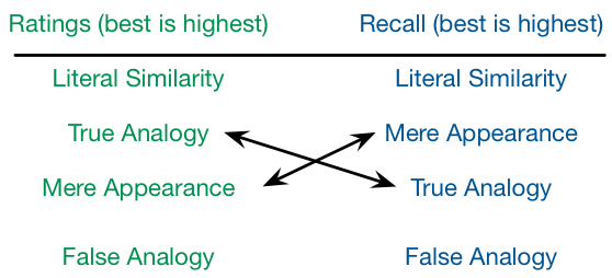
They found that while subjects would rate the analogies, from best to worst, as literally similar, true analogy, mere appearance, and false analogy, their recall for stories, from best to worst, was literally similar, mere appearance, true analogy, and false analogy.
Try discerning the important difference! My PhD advisor kindly pointed out that actually parsing this was hard, and recommended a diagram instead. Here’s a rendition of what resulted:
In this case it’s much easier to see how the two differed. (If you want to find out what’s important in the diagram, I’m happy to talk about analogical reasoning for as long as you can stand it! ;)
The point I’m making is that there are times when diagrams are very useful for communicating. And, if you’ve followed this blog for a fair amount of time, you’ve seen I use diagrams a lot. I use them to think ‘out loud’, and I think it’s important. As Larkin & Simon argued in their Cognitive Science article, Why a Diagram is (Sometimes) Worth Ten Thousand Words, diagrams let us map conceptual relationships to spatial ones. And so if I want to understand the conceptual relationships, I start laying out spatially, and adjust until they make sense to me.
And my concern is that we aren’t using this powerful visual tool enough. Sketchnotes are really nice ways to capture presentations, and depending on the skill of the noter, they may communicate it all, or help recall if you’ve seen it. Similarly, my mindmaps of keynotes capture the flow of the discussion and the relationships (at least as I parsed it), but may only make sense if you heard the talk.
But representing things with diagrams is not only a personal thinking tool, it can be a powerful way to communicate concepts, and that’s an important component of a good learning experience design, providing a conceptual model to guide performance.
So I’m surprised we don’t talk about diagrams more. It may seem hard (certainly trying to create an infographic is harder than it seems, from my experience ;), but there’s some systematicity to it. There are principles, and types of diagrams, and more to explore. And tools that make it easier (though even Powerpoint or Keynote can be used to make diagrams). Diagrams aren’t the only visuals that help (c.f. graphs and tables), but they’re an important tool in your thinking toolbox. I encourage you, as part of your meta-learning toolkit, to play around and get your mind around diagrams. Your thinking, and your learning design, can be better as a consequence.

Leave a Reply