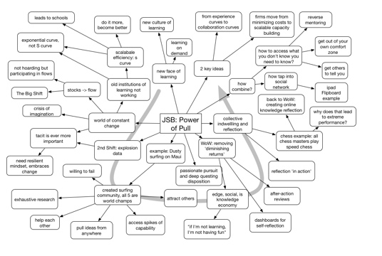
In response to my recent mindmap of Andrew McAfee’s conference keynote (one of a number of mindmaps I’ve done), I got this comment:
Does the diagram work as a useful way of encapsulating the talk for someone who was there? Because, speaking as someone who wasn‘t, I find it almost entirely content-free. Just kind of a collection of buzz-phrases in thought bubbles, more or less randomly connected.
I‘m not trying to criticise his talk – which obviously I didn‘t hear – or his points – which I still have no idea about – but the diagram as a method of conveying information is a total failure to this sample size of one. Possibly more useful as a refresher mechanism for people who got the talk in its original form?
Do mindmaps work for readers? Well, I have to admit one reason I mindmap is completely personal. I do it to help me process the presentation. Depending on the speaker, I can thoughtfully reprocess the information, or sometimes just take down interesting comments, but there are several benefits: In figuring out the ways to link, I’m capturing the conceptual structure of the talk (really, they’re concept maps), and I’m also occupying my personal bandwidth enough to allow me to focus on the talk without my mind chasing down one path and missing something. Er, mostly…
Then, for a second category, those who actually heard the talk, they might be worthwhile reflection and re-processing. I’d welcome anyone weighing in on that. I don’t have access to someone else’s example to see whether it would work for me.
Then, there are the potential viewers, like the commenter, for whom it’s either possible or not to process any coherent idea out of the presentation. I looked back at the diagram for McAfee’s keynote, and I can see that I was cryptic, missing some keywords in communicating. This was for two reasons: one, he was quick, and it was hard to get it down before he’d moved on. Two, he was eloquent, and because he was quick I couldn’t find time to paraphrase. And there’s a more pragmatic reason; I try to constrain the size of the mindmap, and I’m always rearranging to get it to fit on one page. That effort may keep me more terse than is optimal for unsupported processing.
I will take issue with “more or less randomly connected”, however. The connections are quite specific. In all the talks I’ve done this for, there have been several core points that are elaborated, in various ways by talk, but each talk tends to be composed of a replicated structure. The connections capture that structure. For instance, McAfee repeatedly took a theme, used an example to highlight it, then derived a takehome point and some corollaries. There would be ways to more eloquently convey that structure (e.g. labeled links, color coding), but the structure isn’t always laid out beforehand (it’s emergent), and is moving fast enough that I couldn’t do it on the fly.
I could post-process more, but in the most recent two cases I wanted to get it up quickly: when I tweeted I was making the mindmap, others said they were eager to see it, so I hung on for some minutes after the keynotes to get it up quickly. McAfee himself tweeted “dang, that was FAST – nice work!”
I did put the arrow in the background to guide the order in which the discussion came, as well, but apparently it is too telegraphic for the non-attendee. It happens I know the commenter well, and he’s a very smart guy, so if he’s having trouble, that’s definitely an argument that the raw mindmap alone is not communicative, at least not without perhaps some post-processing to make the points clear.
Really valuable to get the feedback, and worthwhile to reflect on what the tradeoffs are and who benefits. It may be that these are only valuable for fellow attendees. Or just me. I may have to consider a) not posting, b) slowing down and doing more post-processing, or…? Comments welcome!
I’ve had a slight blindspot for photos and video because I peg the ‘conceptual’ meter. I recognize the value, though I don’t play with the files enough (tho’ I took a digital audio/video editing course more than a decade ago, and recently edited home videos for my wife’s birthday). Photos and videos are really good for contextualizing, and that’s particularly valuable for examples (and practice).
What I like about it is it takes a longer term view of skills. The sample he showed (and of course I realize it’s presented in the best light) was a learning map for a course, but with lots of components spread out over time (sample map shown). There’s a priori assessment, content, activities with managers, etc.; a mix of activity, practice, reflection, just the sort of model we should be designing. We know spaced practice matters, with reactivation, reflection, etc. It’s also valuable to go back to the workplace, and then check-in later to see how things are going. It’s a fuller picture of what learning’s about.